Human Breakthroughs Don’t Show Up on Dashboards
Your AI dashboard measures motion: tokens, seats, headcount. The judgment that turns motion into a breakthrough is the one thing it can’t capture, and it’s where your value now lives.

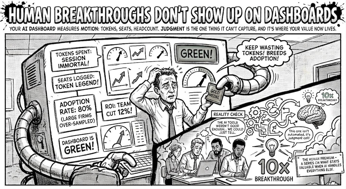
Somewhere inside Meta last winter, an engineer reprocessed a batch of documents that didn’t need reprocessing. He knew exactly what he was doing. He was climbing a leaderboard. The company had built an internal board ranking more than 85,000 employees by token consumption, with titles like “Session Immortal” and “Token Legend,” and he had figured out the fastest way to the top. In thirty days the company burned 60.2 trillion tokens, a sum that would run roughly $900 million at standard rates. Gergely Orosz reported the whole thing before Meta quietly discontinued the board.
One engineer guessed the real point was harvesting training data. The simpler reading is that Meta told its people that using AI a lot was the same as being good at it, and its people, being good at their jobs, got very good at using AI a lot.
Orosz has a name for this. Tokenmaxxing: inflating token usage to look productive, the way an earlier generation of engineers gamed lines of code. It’s a funny story until you notice that the same instinct runs every AI scorecard in the building. We are measuring the activity because the activity is easy to see, and then we are reading the activity as if it were the result.
If you lead a team or a company through this, the numbers you’re using to judge your AI program are probably doing the same thing. Usage is up, adoption is up, headcount is down, the dashboard is green. And none of those numbers can tell you the one thing you want to know, which is whether the work got better. That gap, between the metric and the meaning, is where most AI strategies are quietly failing while reporting success, and where the few real breakthroughs hide too.
Return on subtraction
The cleanest number to show a board is a smaller payroll. So that is the number companies show.
Gartner studied 350 executives at billion-dollar companies and found that 80% of organizations deploying autonomous AI had already cut their workforce. Here is the part that should stop you: those reductions had no correlation with higher returns. The layoff rates among companies reporting strong ROI were nearly identical to the rates among companies seeing none. Cutting people produced budget room, and the budget room got booked as if it were the value.
This is return on subtraction, and it’s seductive because subtraction shows up in a way improvement doesn’t. You can put “reduced team by 12%” on a slide. You can’t as easily put “the work our remaining people do is now sharper,” because that requires judgment about output, and judgment is slow and arguable and doesn’t fit in a cell. Sam Altman has a phrase for the cover story: AI washing, where a company pins a layoff on automation when the real reasons were something else. The automation becomes the press release, the savings become the ROI, and nobody checks whether the AI did anything.
Gartner’s own read is that the organizations getting real value treat AI as a way to amplify their people. They invest in oversight and upskilling, the unglamorous human scaffolding. Those investments are real, and they’re working. They’re also hard to fit on the same slide as a headcount number, which is exactly why they lose the argument inside most companies.
The usage trap
When you reward people for using a tool, they will use the tool. Whether the tool is helping is a separate question, and it is the question the usage number cannot answer.
Salesforce set minimum monthly AI spend targets for its engineers, then removed the caps to “eliminate friction,” and developers promptly began requesting projects for no reason but to burn the quota. Microsoft’s consumption dashboards bred the same theater: engineers reprocessing documents and prototyping features nobody meant to ship, all to avoid looking insufficiently AI-native. The behavior was rational, and it was waste dressed as adoption.
The workplace data confirms what the gaming stories imply. ActivTrak’s 2026 report found AI adoption at 80%, and also found that every category of work expanded after AI arrived: email volume up 104%, messaging climbing alongside it, and not a single category of work shrinking. The tools were supposed to take work off people’s plates. Instead they added a layer on top. The lived version of that statistic is the marketer who spends the morning in an AI tool spinning up campaign variants, then loses the afternoon to the flood of email and review threads those variants set off.
ActivTrak located a genuine productivity sweet spot, workers spending 7 to 10% of their hours in AI tools hitting 95% productivity, but only 3% of employees were in that band. The rest were either barely touching the tools or drowning in them. Adoption was nearly universal. Effective use was a rounding error.
I have watched this from the other side. At Typeface my team had Claude Code, ChatGPT, and a dozen other tools open all day, and a real part of the leadership job was pushing people past the comfortable edge of what they used them for. Most stayed where it was safe. A few didn’t, and there is no looking back for them. They have become the people who challenge whatever the current solution is and keep dragging the rest of us forward.
What set them apart was never how many tokens they spent. The tokens were an artifact. The shift came when someone started with a genuine problem and wanted a 10x answer to it instead of a 10% one. Reward the token count and you breed tokenmaxxing. Reward the hunger for a 10x solution and the usage takes care of itself, and you cannot run that causation backward, which is exactly what every usage dashboard tries to do.
Shopify is the one company in this set that seems to have understood the trap. It celebrated heavy AI usage only when it was paired with great work, renamed its leaderboard a plain “usage dashboard” to kill the competition it was breeding, and started looking at which tokens cost the most rather than counting raw volume. That last move stops short of measuring quality, but it points the right direction: away from the activity number and toward what the spend was buying. The question still waiting at the end of that road is what got better because the team used AI, and answering it means being willing to look at the work.
The number that depends on who you ask
Even the adoption rate, the headline figure everyone quotes, falls apart the moment you ask how it was built. Three federal surveys measured AI adoption in the same economy at the same time and came back with 18%, 41%, and 78%, depending on whom they asked. And even the friendliest number is shallow: 41% of workers say they use AI at work, but only 12% touch it daily. Adoption counts who logged in and says nothing about who got good. Every triumphant percentage you have read papers over that gap.
So we have three different illusions feeding the same dashboard: layoffs that read as ROI, usage that reads as productivity, adoption rates that read as transformation. Each one measures something real and easy to count, and none of them touches the thing that matters.
What I learned trying to measure “good”
I build content infrastructure at Typeface, so this stopped being an abstraction for me a while ago. Making quality measurable at scale is the problem I spend my days on, and being on the building side of it taught me why the easy numbers always win.
I see it most clearly in what those people went on to build. They came back with things no straight line of coding would have produced. One carried a design from one format to another at a fidelity hand-written code never reached. Another cracked web and email layout problems that had resisted us for years. A third compressed a brand’s whole identity into something a system could carry. A designer rebuilt an entire app himself, because he now could, with none of the loss that usually creeps in when requirements and taste have to be handed from the person who holds them to the person who builds.
What every one of these shares is that no quantitative measure captures the impact. I can tell you each saved us weeks and opened a non-linear path we would not have found otherwise, but I cannot hand you the number that proves it, because there isn’t one. The value is qualitative, and reading it means sitting with the work, not watching a gauge. There is a time for metrics, and this isn’t it. Forcing a number onto this kind of impact would measure the wrong thing and miss the point.
The same gap shows up the moment I turn from my own team to our customers. The conversation I keep having goes like this. An enterprise marketing leader tells me the AI content tools they tried weren’t good enough. I ask how they were measuring quality. There’s a pause, and then: “We could just tell.” That answer is honest, and it holds up fine when a team ships five pieces of content a month. At five hundred, gut feel stops scaling, and the team falls back on the only instruments it has, the ones that count volume, throughput, and spend. None of those can see whether the work is any good. They measure motion because motion was the easy part to instrument.
So the work becomes building the instrument that leader never had: a way to judge quality that doesn’t run on one person’s gut and doesn’t collapse at five hundred pieces. What surprised me is which part is hard. The legible dimensions go first and go fastest. You can teach a system brand voice fidelity, claim accuracy, tone, whether a piece stays on message. Encode the rule, check the box. The trouble is that every time we made one dimension measurable, the thing that actually mattered slid one level up, out of reach of the rule we’d written. The hardest case is the piece that clears every check and a human still reads it and feels nothing. There’s no rule for that yet, and the teams claiming they’ve automated it away are working on a smaller problem than they think.
The lesson that survived all of it is simple to say and slow to build. The metric has to point at the output rather than the activity, and a person who knows what good looks like has to stay in the loop, close to where the work gets made. Volume dashboards are cheap to stand up, which is exactly why so many teams end up managing by them. The instrument that earns its keep, the one that tells you whether the content deserved to ship, is the one nobody builds by default, because it’s slow and human and hard.
What the dashboard cannot see
Pull the three failures together and they share one root. Every metric that misleads here is a metric of motion: heads removed, tokens spent, seats logged in. What none of them captures is whether any of that motion improved the actual output, because output quality is a judgment, and judgments are precisely what a dashboard is built to avoid. And it cuts both ways. The same dashboard that cannot tell you the work is hollow cannot tell you when someone has done something remarkable: the non-linear leap, the week saved, the app rebuilt because one person no longer had to hand their taste to anyone else. Failure and breakthrough are equally invisible to it, for the same reason: both are judgments about the work, and the work is the one thing the dashboard never looks at.
Call it the measurement mirage: a dashboard that answers every question except the one that matters. Did the work get better?
This is the through-line of everything I have been writing about this spring. I argued a few weeks ago that enterprise AI produces beautiful empty rooms, systems that run flawlessly while nobody can say whether what they produce is any good. The measurement mirage is how the room stays empty without anyone noticing. The lights are on, the meters are spinning, the chart points up. The one instrument missing is the one that would tell you the work is hollow.
This is why organizations reach for the proxy. Counting tokens is easy. Counting layoffs is easy. Deciding whether a piece of work is good enough to put your name on requires a human who knows what good looks like, and that human is expensive, slow, and cannot be fully automated. The proxy is cheap and fast and feels objective. It’s also measuring the wrong thing, and the gap compounds every quarter you trust it.
The human premium, the thread running through this whole series, lives in that gap. The judgment that decides whether the output is worth shipping is the part AI cannot yet supply and the part no dashboard can render. When the dashboard tracks motion, the quality of the work goes unmeasured, and the one capability that still separates a company doing real work from a company generating expensive noise gets steadily priced down.
The question worth asking
The fix lives in the work itself. Someone has to sit with what the team shipped and decide whether it got better.
The leaders getting real value have made a quiet switch. They replaced the usage question with a harder one: did the output improve? Shopify asks which tokens earned their keep. The Gartner leaders invest in the humans who oversee and refine the work. In both cases somebody decided the activity number was a distraction and went looking for the harder answer.
Tomorrow morning, before you read another AI usage report, try the test that no dashboard runs for you. Pick one thing your team shipped with AI this week and ask whether it was better than what they would have shipped without it. If you can answer that, you are measuring the right thing. If you cannot, the green chart on your screen is a mirage, and the desert it is hiding has been there the whole time.
This is the first essay in The Human Premium, a series on what stays valuable when AI handles everything else. The bridge essay, Foraging: The Prestige, introduced the thesis.